
You may have noticed a change in our homepage and blog’s User Interface (UI) over the last few months. That was just the beginning; they were a small part of a larger rollout.
While it's taken some time to come to fruition with many months of testing to ensure we get it right, we're happy to officially announce our much-anticipated UI overhaul of the Control D Dashboard!
This isn't just a fresh coat of paint; we've listened to your feedback, analyzed what does (and doesn't) work, and studied your pain points to improve your experience with Control D.
In this blog post, we'll walk you through the highlights of our revamped UI and show you how these updates make your DNS management experience smoother, more intuitive, and – dare we say – fun.
Why the Overhaul?
Before diving into the specifics, let's talk about why we decided to embark on this journey in the first place.
As a modern, customizable DNS management service, Control D empowers you to control your online browsing experience with as little friction as possible.
However, we realized that our previous UI – while functional – wasn't serving that purpose as well as it could, and introducing new features on the existing interface was hindering the user experience. Plus, it was just time for a change.
We listened to your feedback, analyzed how you interact with the service, and recognized opportunities for improvement. The result? A redesigned UI that combines modern aesthetics with a user-centric design.
A Fresh New Look
The new UI is built on a minimalist philosophy. We've embraced a clean, modern design that's both visually appealing and easy on the eyes, all while maintaining the same functionality as before.
Our design team focused on creating an airy and uncluttered interface with minimal fluff and no wasted real estate to give it a more sleek and elegant look.
You'll find you can now view more, and do more, in a single Dashboard view. Prioritizing spatial efficiency is a principle carried throughout the entire UI overhaul.
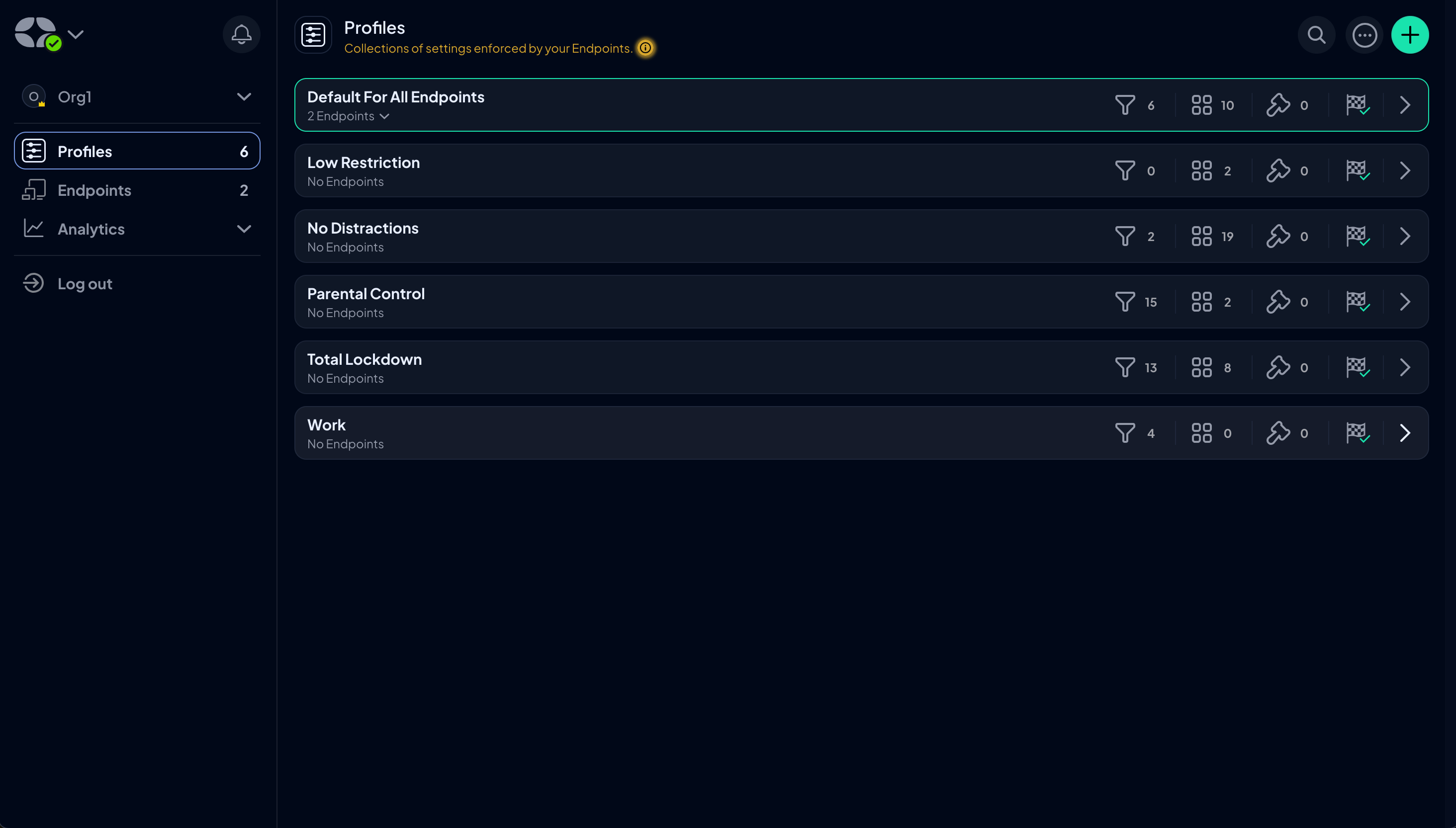
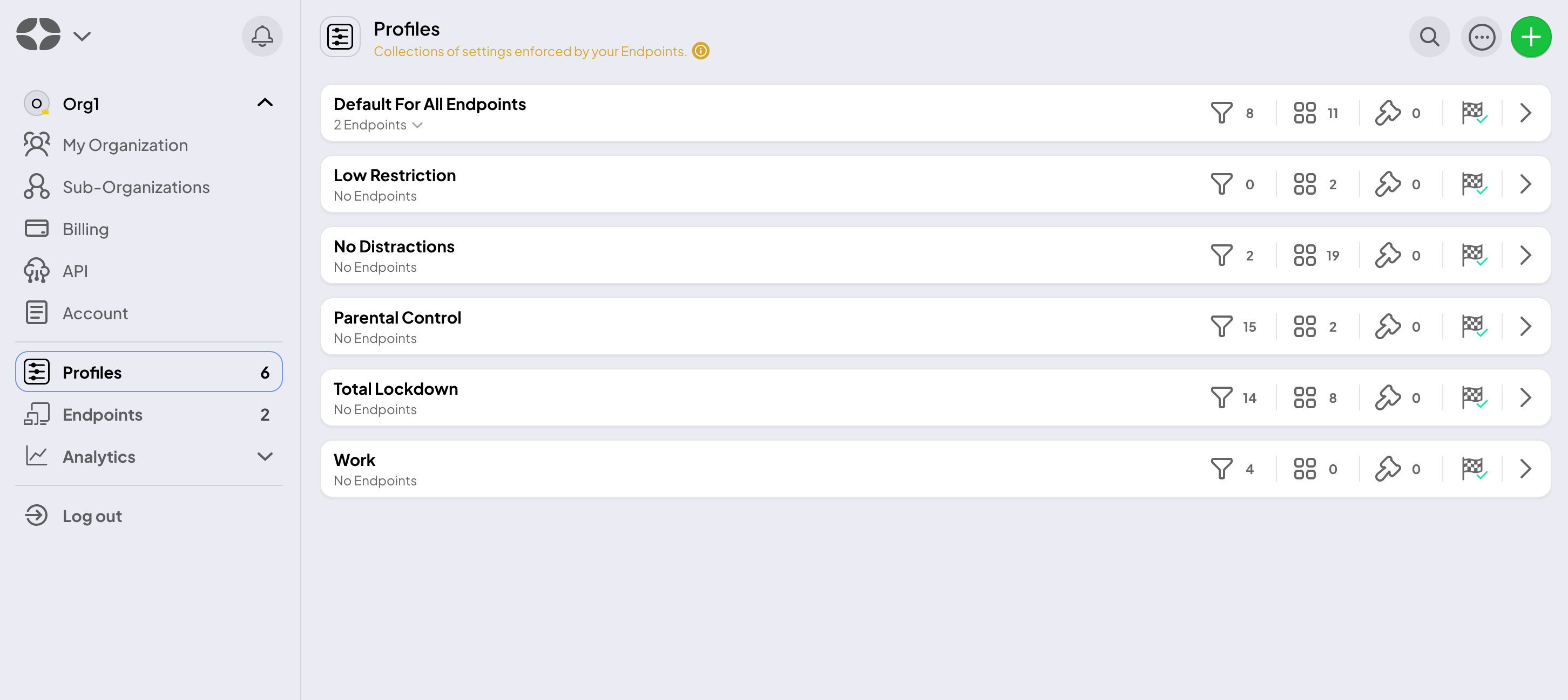
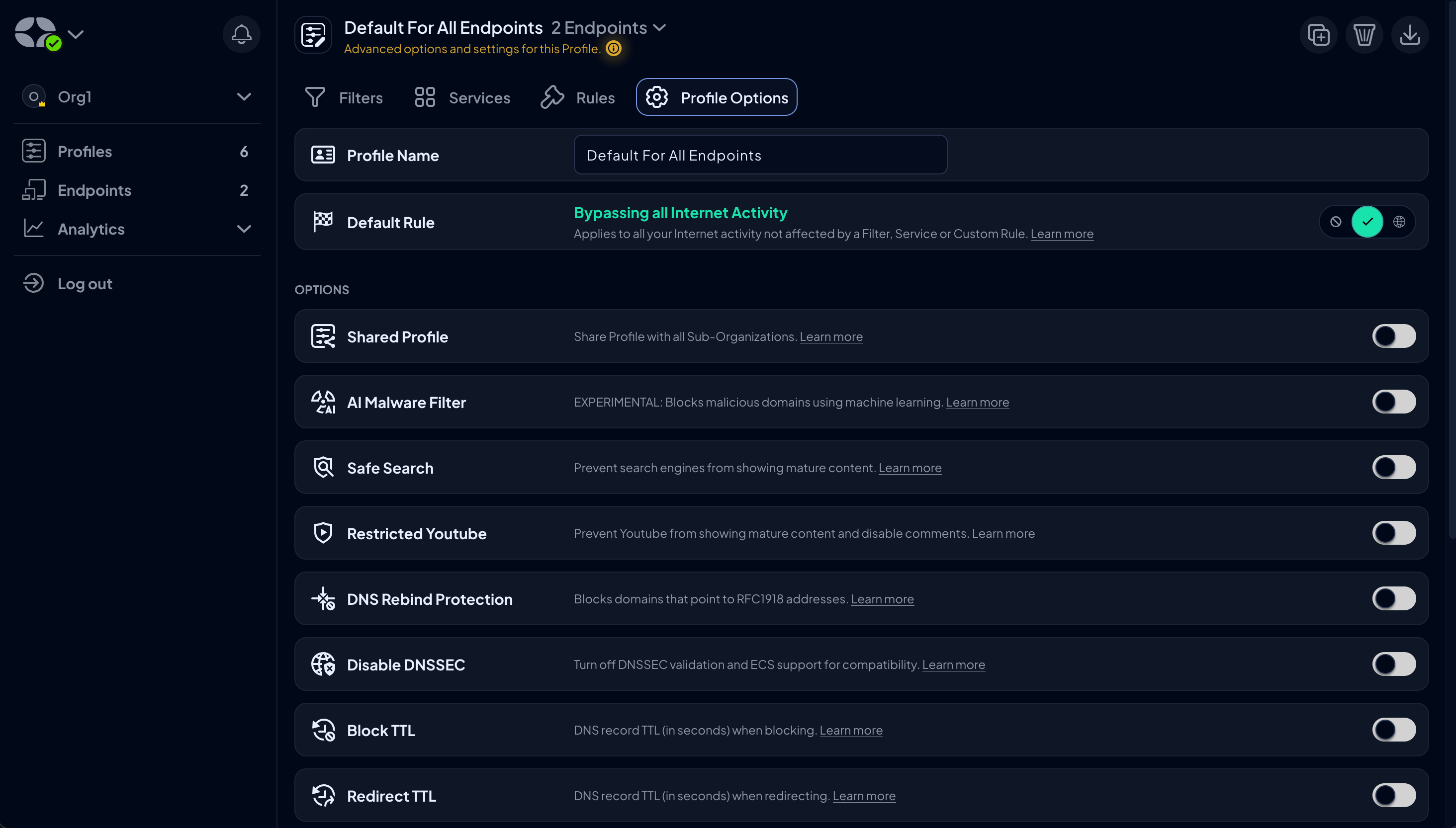
This is most noticeable in the Profiles tab, where your Profiles are now ordered in rows to better use the horizontal space on your device instead of the large rectangular boxes you were shown before.
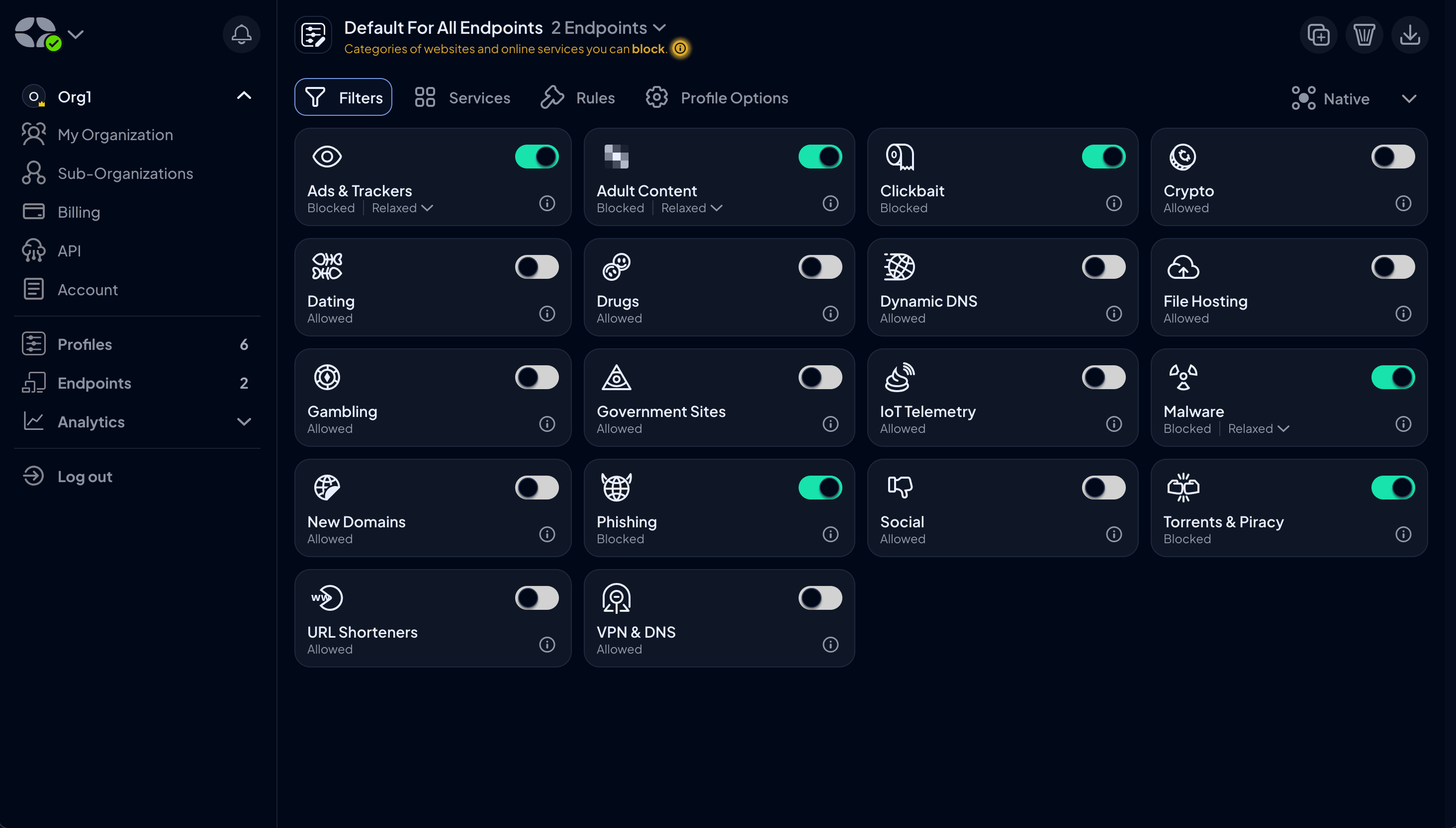
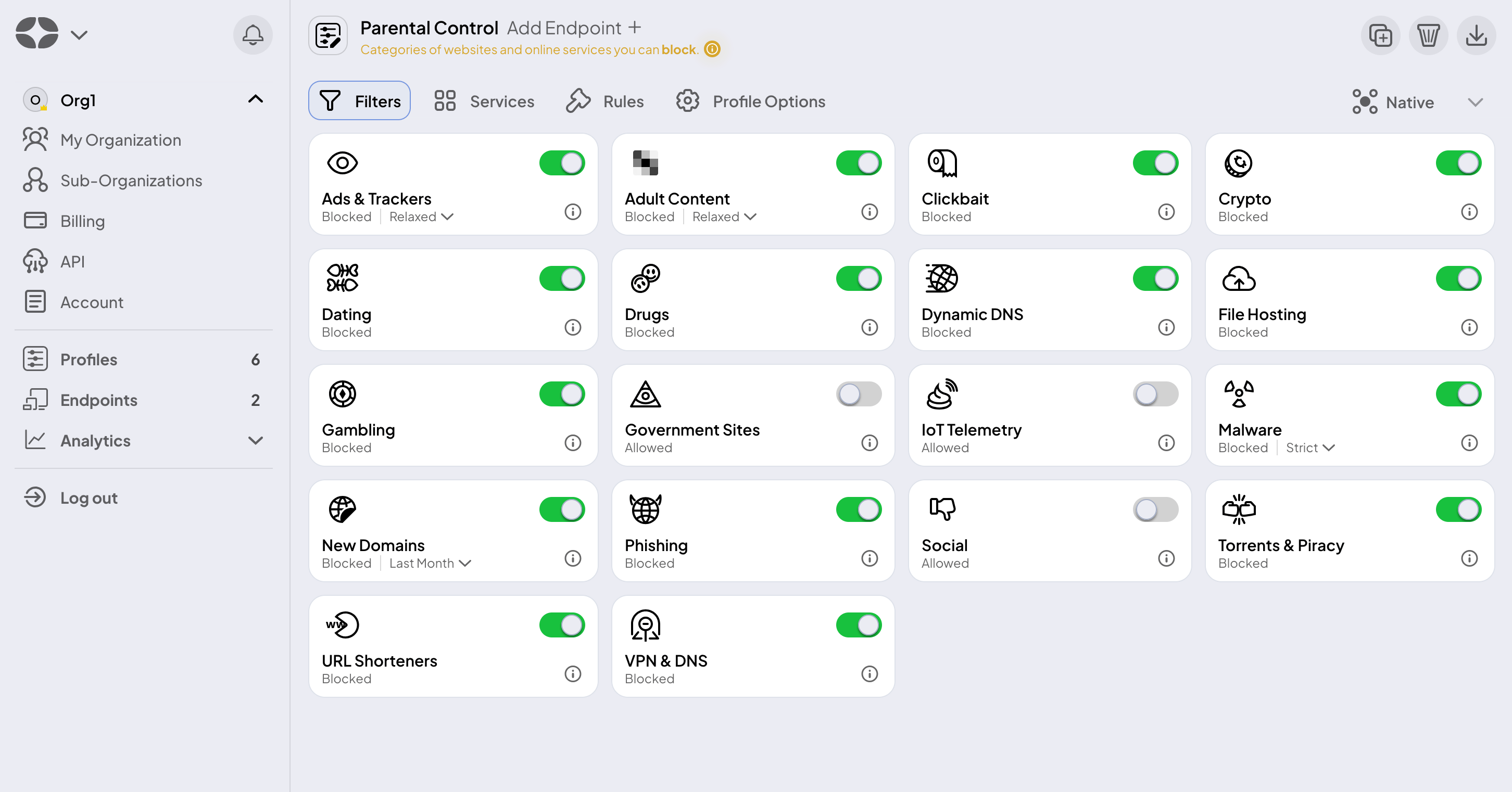
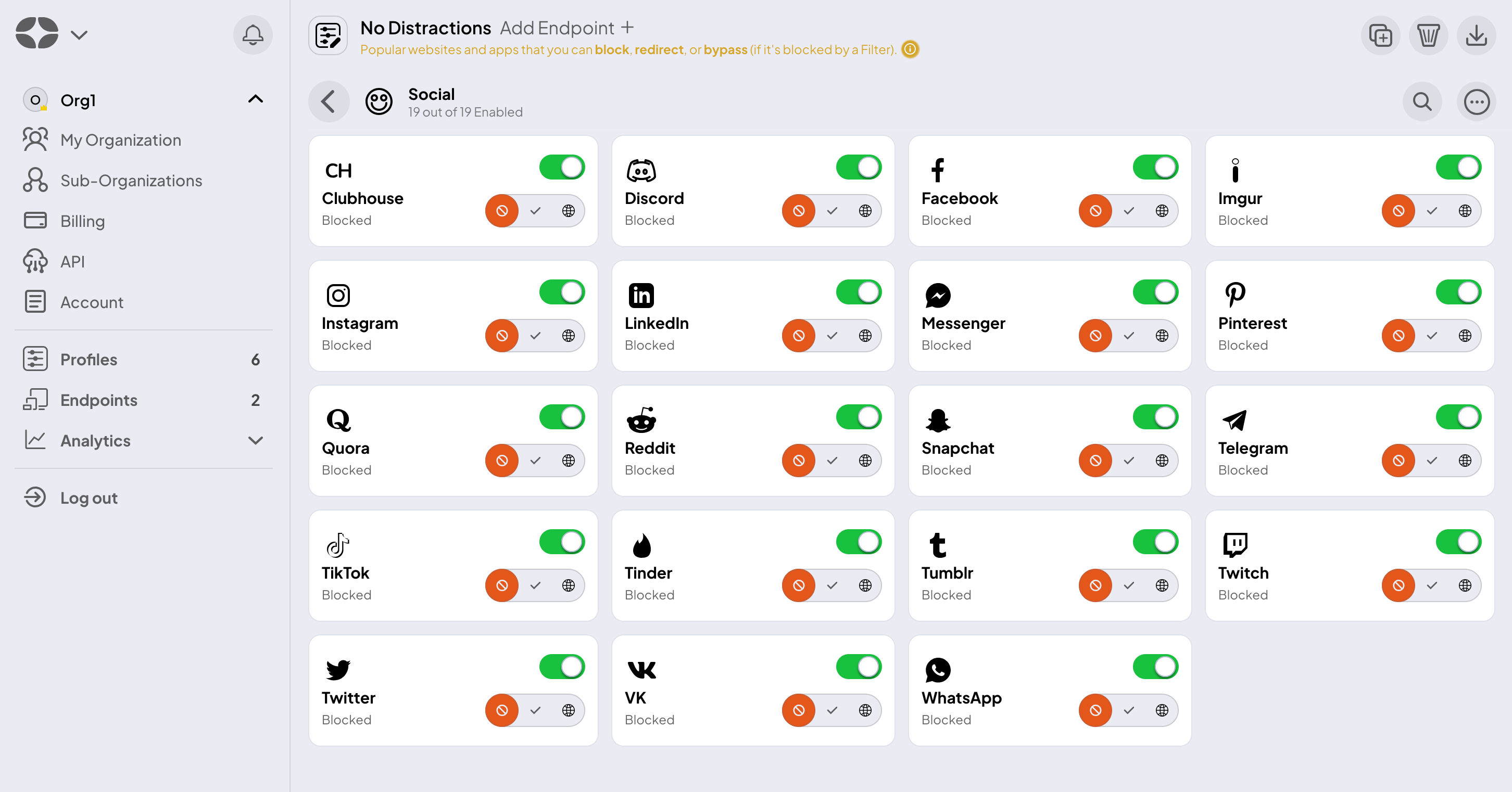
You can also access Filters, Services, Custom Rules, and Profile Options directly on the Profiles page by clicking on the appropriate icon.
We've also updated the color palette, opting for a more subdued and refined theme punctuated with occasional pops of color. This design shift maintains a professional and simple aesthetic and helps you direct your focus and energy on what matters most: customizing your DNS settings and managing your network.
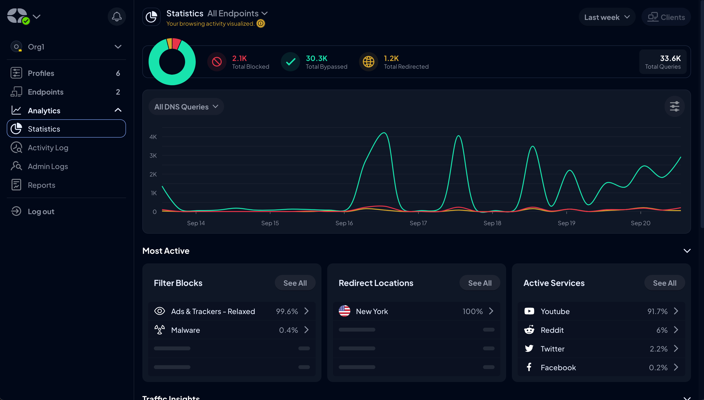
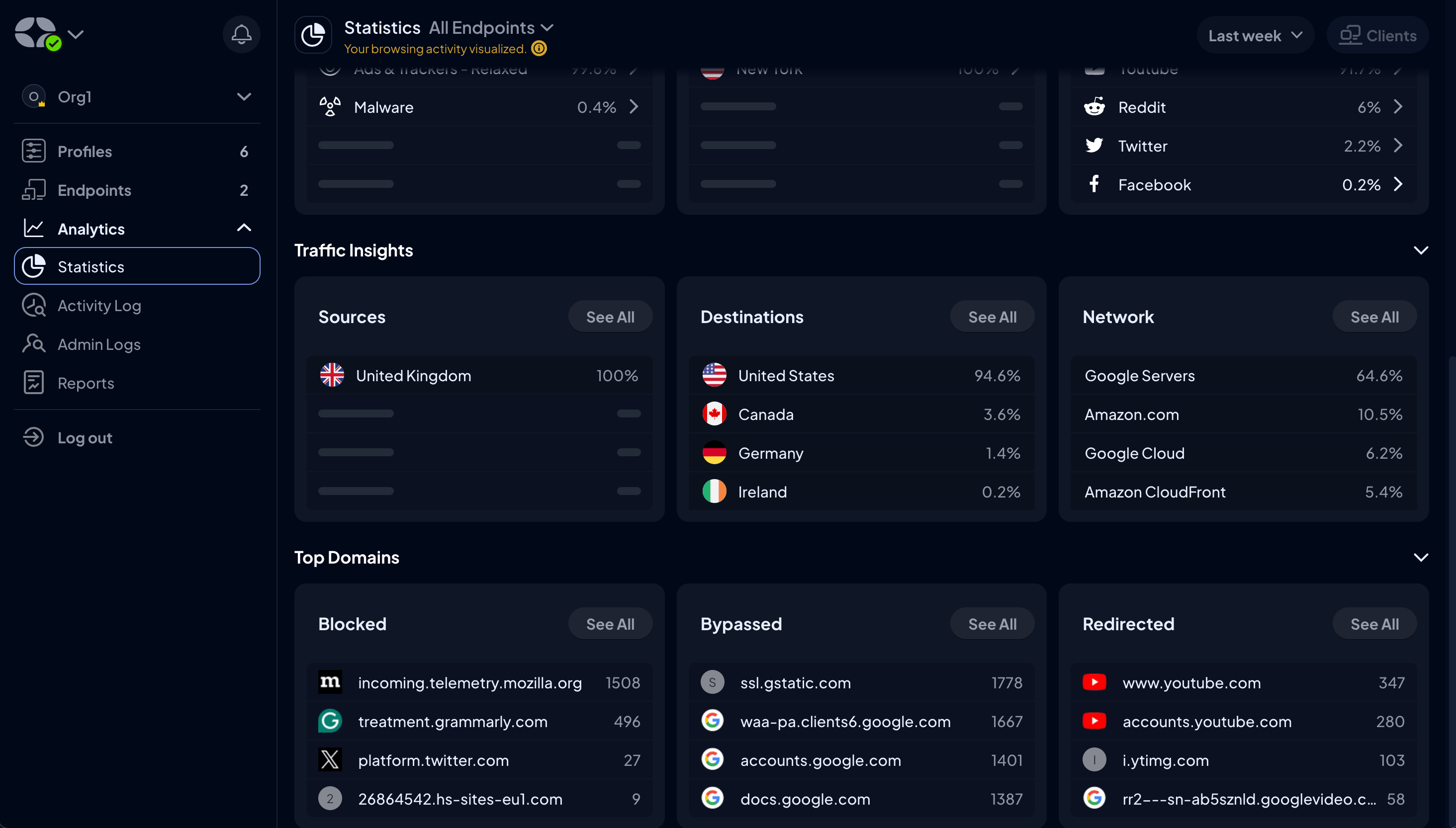
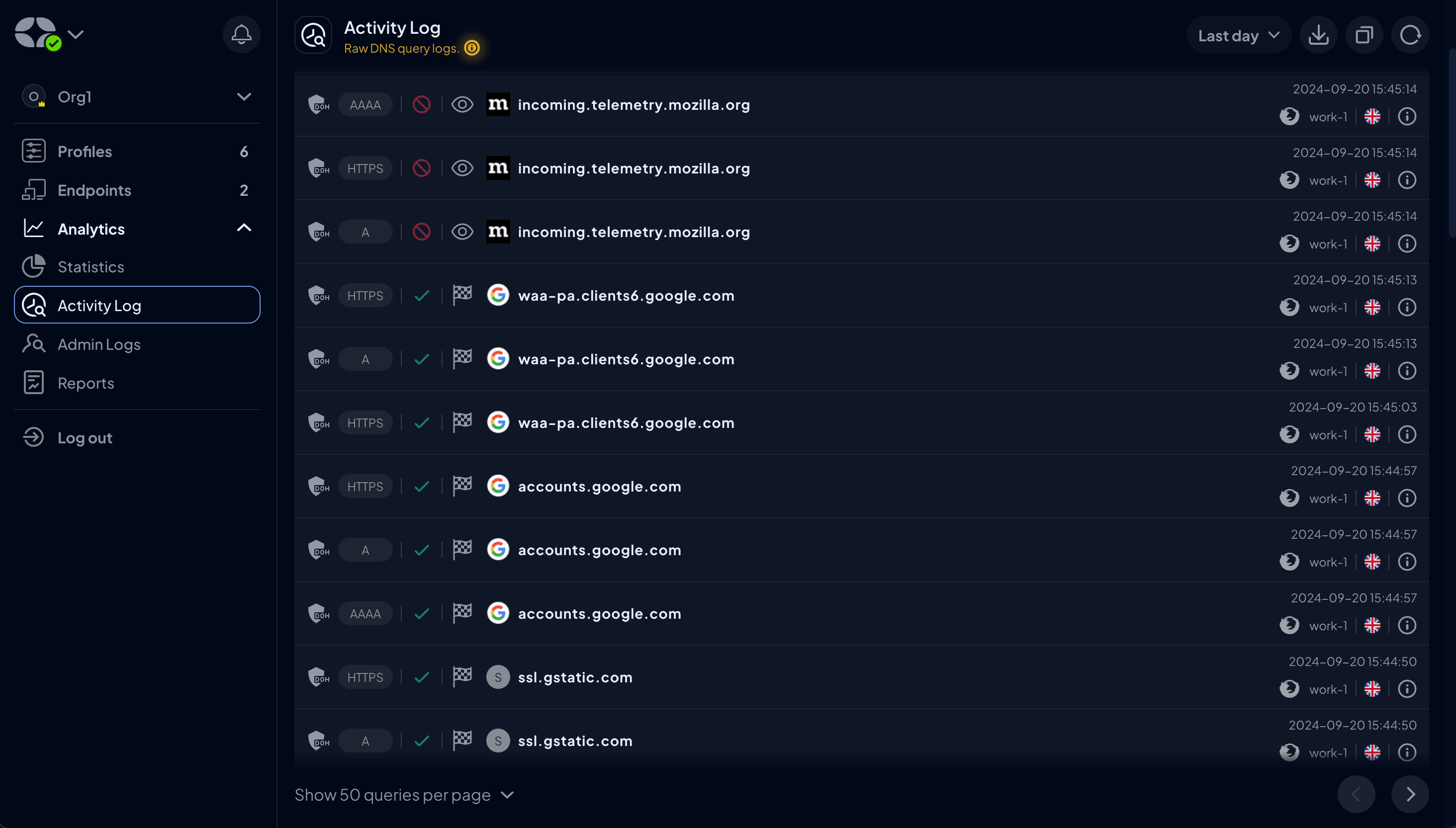
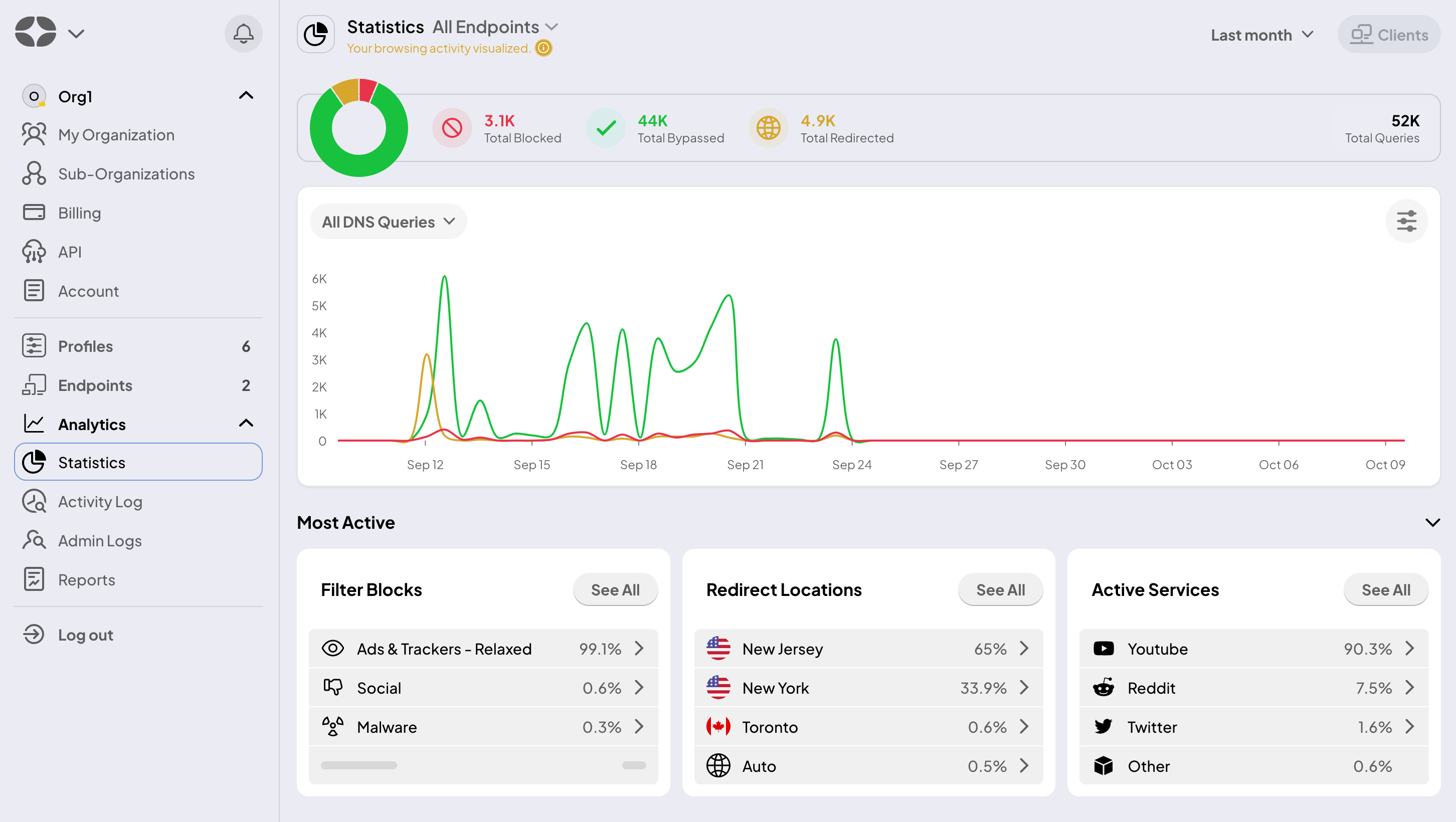
The Analytics Dashboard also got a makeover. It retains all the functionality you're used to for tracking your DNS traffic, monitoring domain requests, and analyzing Filter performance, but it's now presented in a much cleaner and streamlined interface.
Light Mode
You asked, we delivered! As part of this UI facelift, we’re rolling out a feature many of you have been asking for: Light mode.
Whether you’re comfortably set on the darker aesthetic or ready to brighten things up, you can now switch between the two to match your vibe.
To turn on Light mode:
- Navigate to the Account tab
- Click the dropdown menu next to Theme
- Select Light
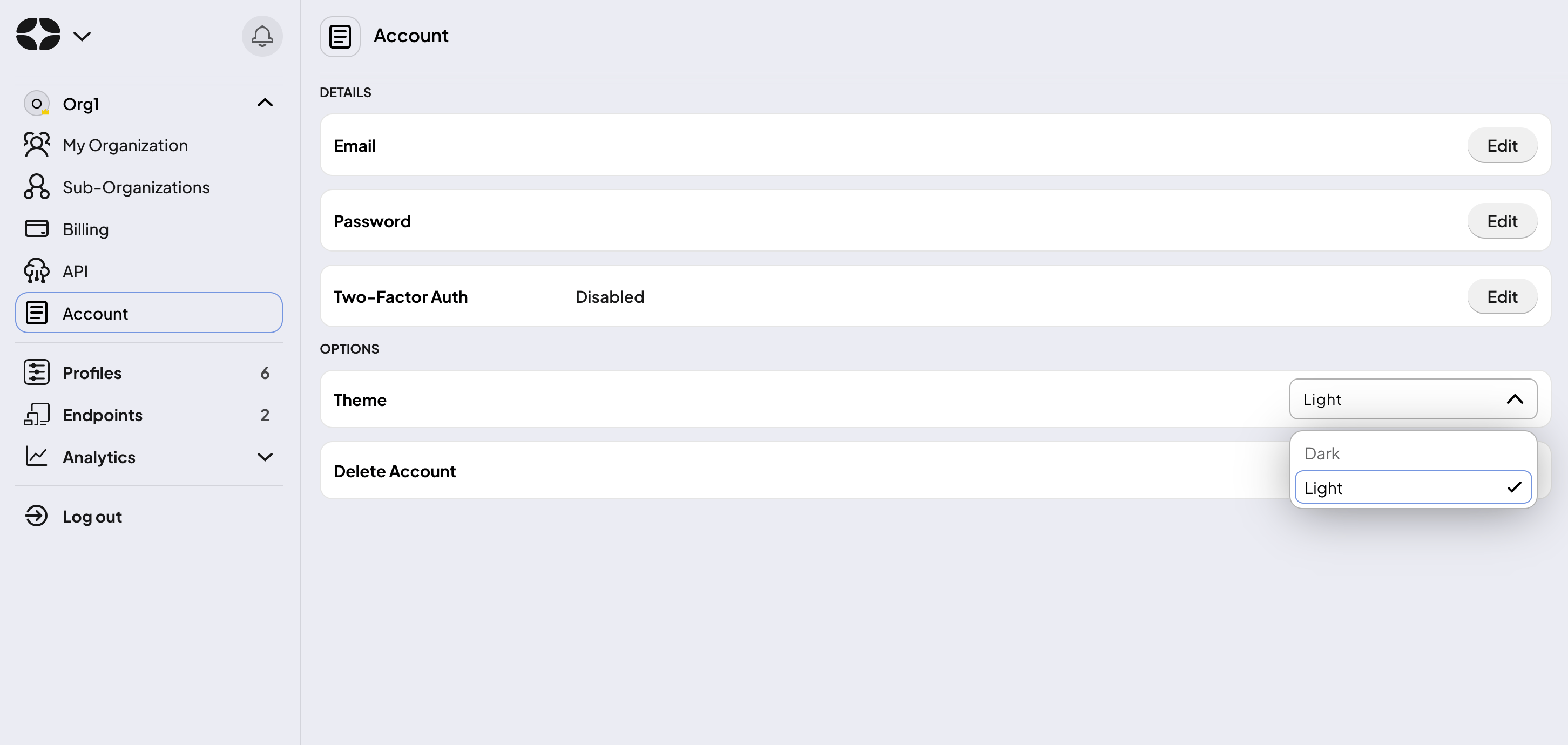
Here’s a sneak peek at what you can look forward to.
Enhanced User Experience
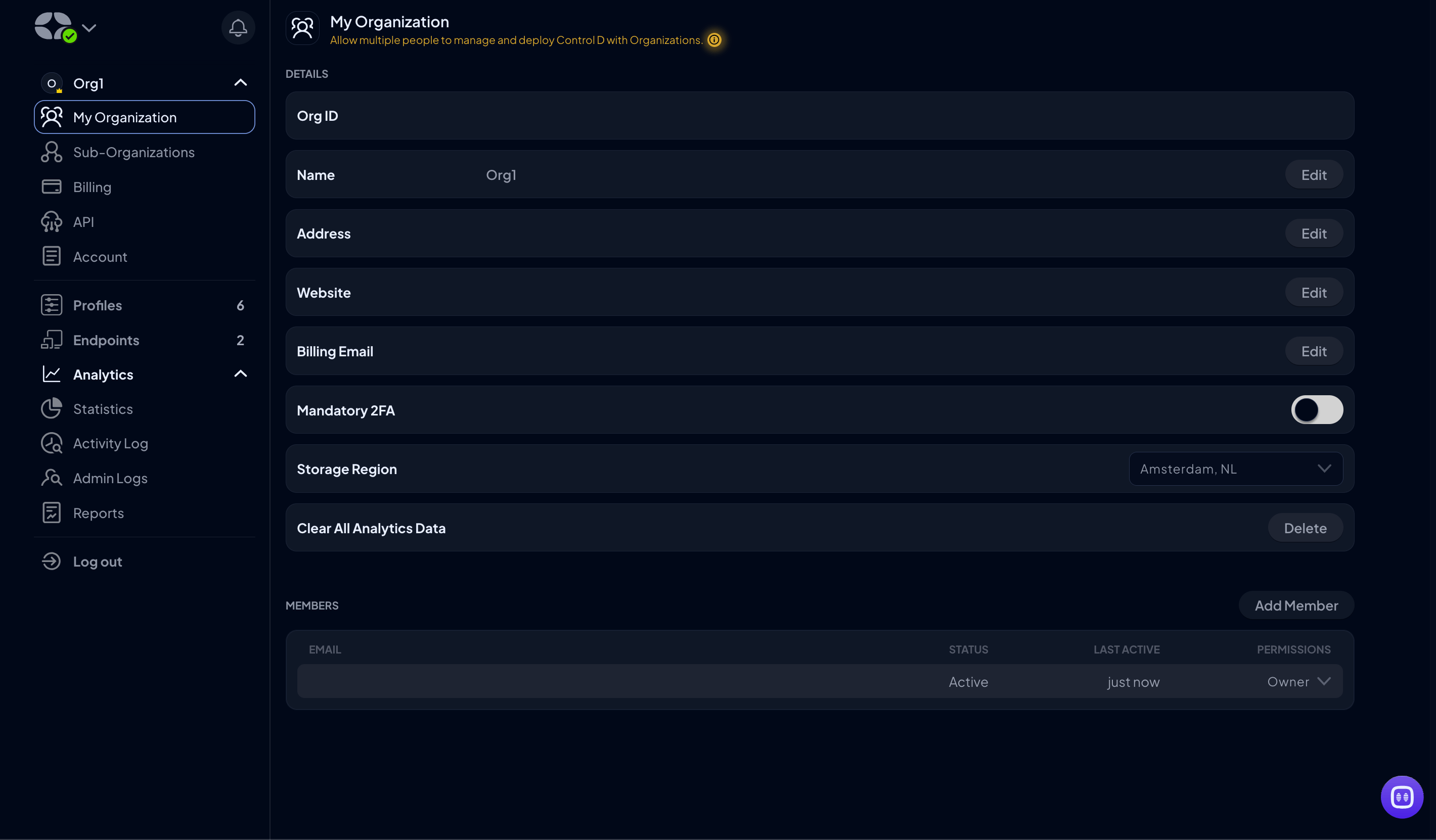
We know that getting around should feel instinctive, so we've reorganized things to make it easier for you to find what you need when you need it. No more hunting through menus or guessing where to click next – everything is logically grouped and clearly labeled.
Streamlined Setup Process
One notable change is how much easier it is to get started with Control D. We've simplified the setup process, breaking it down into clear, manageable steps that guide you through configuring your DNS settings.
Whether you're setting up a new Profile or Endpoint, configuring Custom Rules, or tweaking advanced settings, the process is now more intuitive and less time-consuming.
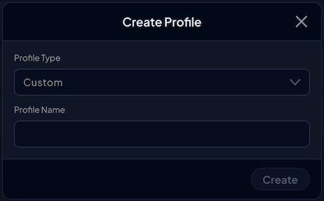
For instance, instead of being overwhelmed with a long list of Profile Options when creating a Profile, simply pick a Profile Type and give it a name. That's it. You can then customize the Profile in one fell swoop by navigating to Filters, Services, Custom Rules, and Profile Options.
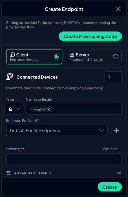
The same applies to creating Endpoints. Instead of navigating through multiple menus, you're now presented with just one containing all the necessary information to get started. You can also navigate directly to the Provisioning area from this popup, saving additional steps like in the old UI.
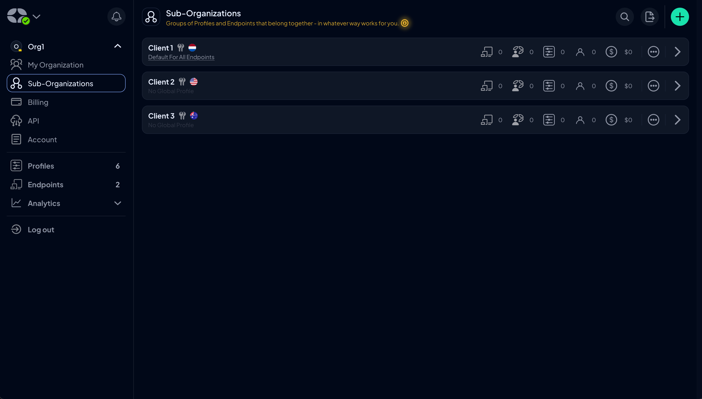
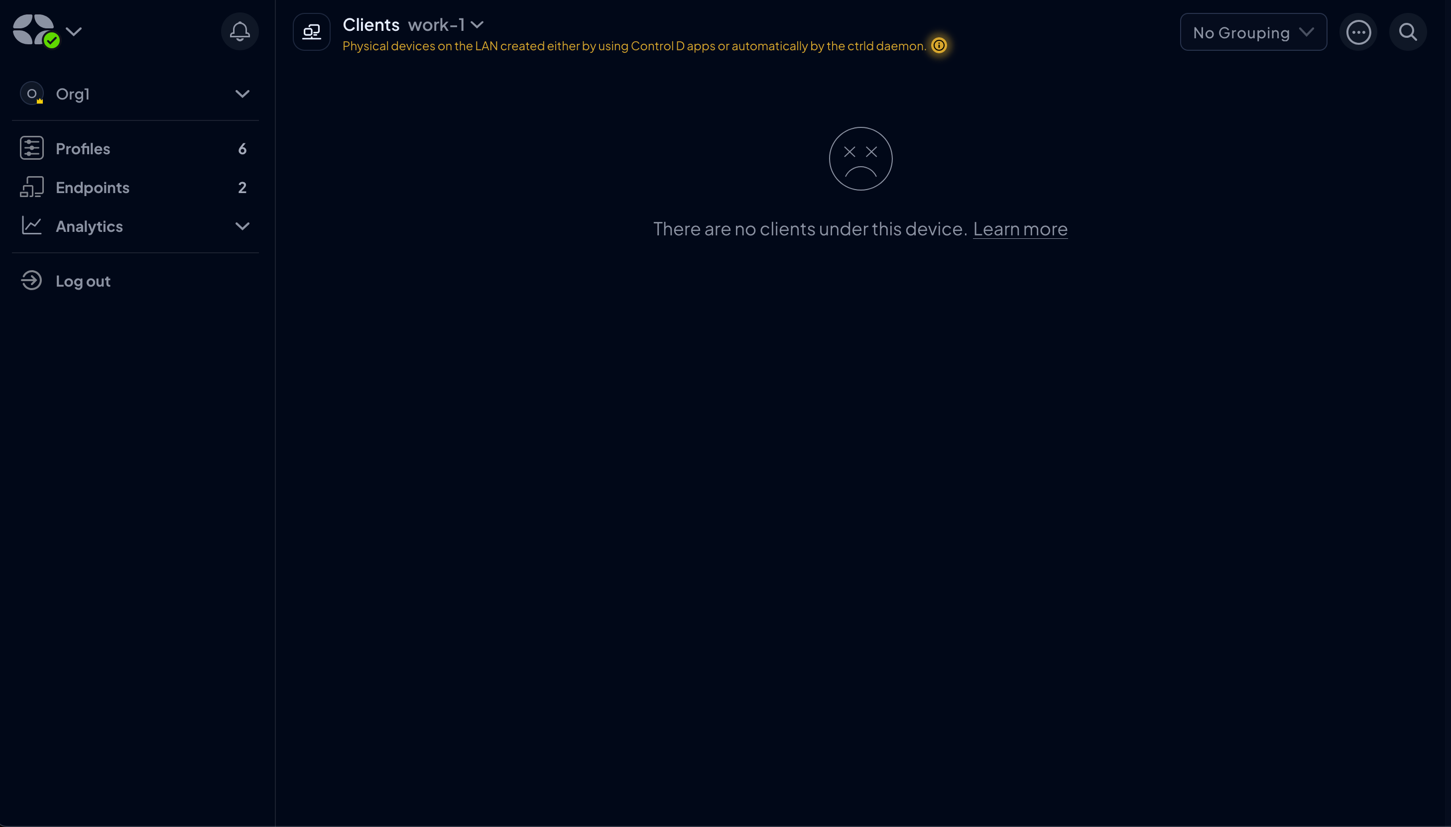
One of the major improvements in the new UI is how we manage Clients. Previously, you had to first create an Endpoint from a Client before you could apply a different Profile, which broke the connection with the parent Endpoint.
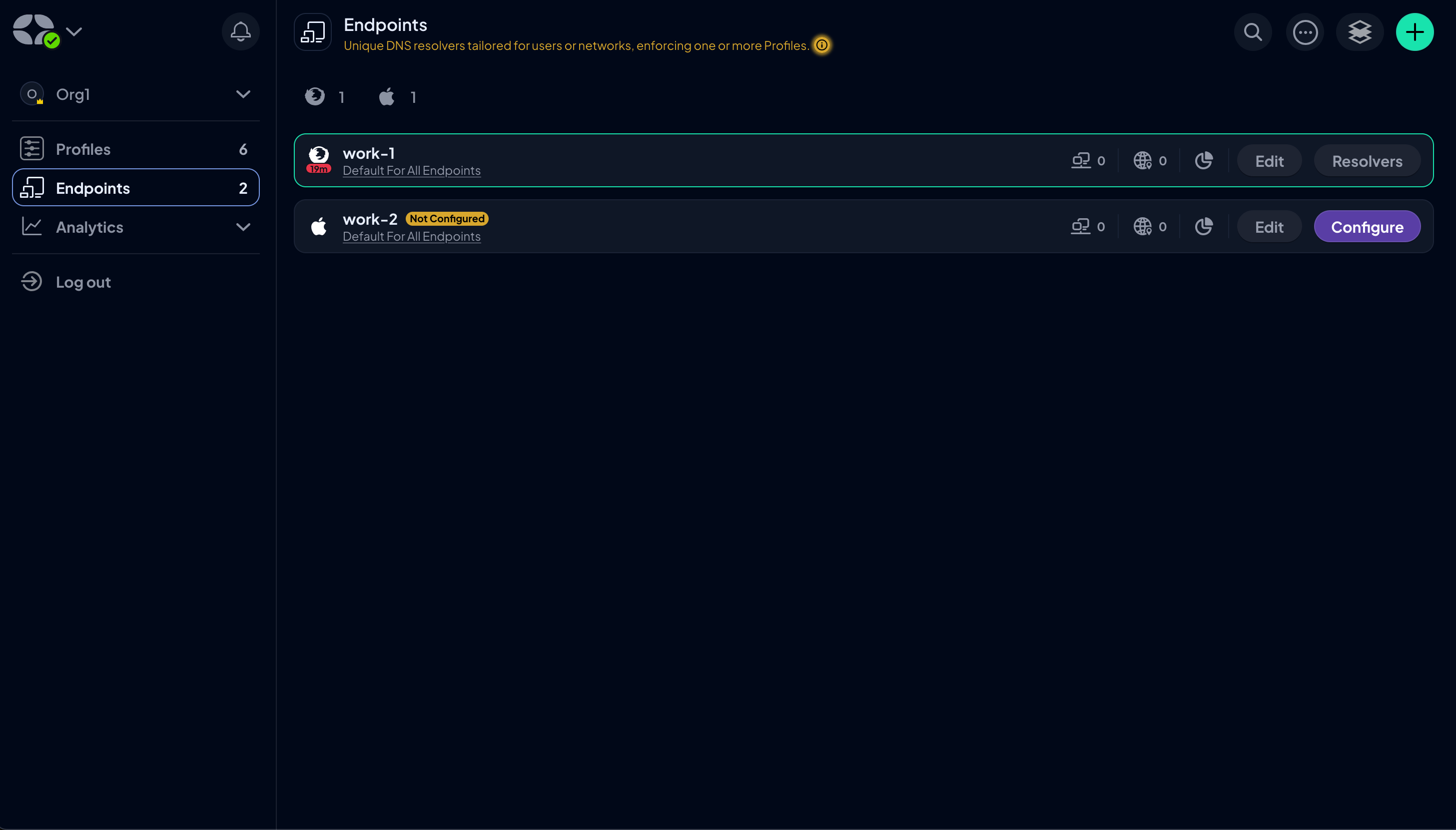
Now, we’ve introduced a dedicated Clients page where you can easily update Profiles for each Client while maintaining the relationship with the parent Endpoint. Additionally, the number of Clients linked to each Endpoint is now clearly displayed on the Endpoints page, so you don’t have to go digging for this information.
Improved Navigation
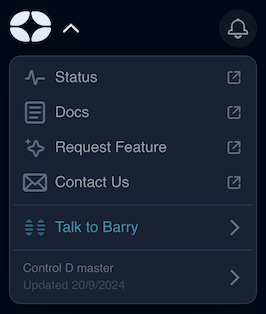
We've introduced a revamped dropdown menu when clicking the Control D logo to reduce the number of clicks required to reach essential pages, such as Status, Docs, Request Feature, Contact Us, and the Changelog. You can also initiate a chat with Barry, and the Notifications bell has been moved to the main sidebar for easy access.
Much like Profiles, all Endpoints were previously shown in a large rectangular box that required multiple steps to perform your designed function. That's been replaced by a sleek dashboard that allows you to access Clients, IPs, Analytics, and the designated Profile for that specific Endpoint with a single click.
Additionally, the small green/gray dot denoting whether an Endpoint was configured has been replaced. Non-configured Endpoints are shown with an easy-to-read label, and configured Endpoints are highlighted in green so you can identify them at a quick glance.
We've also implemented the ability to search for Endpoints by their Resolver ID to make finding specific Endpoints more accessible and moved the Provision tab from the sidebar to the Endpoint dashboard, where it's more applicable.
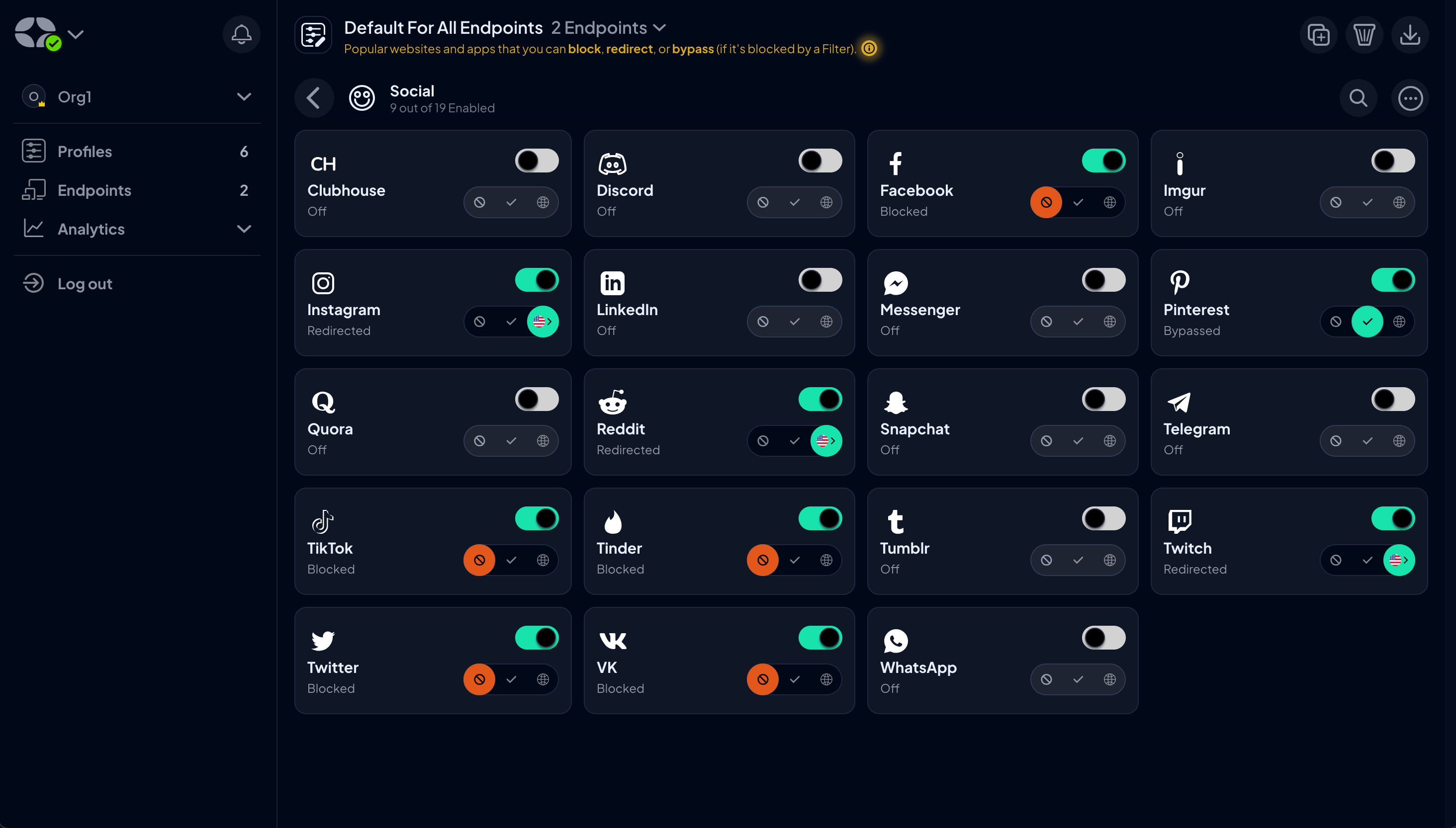
Services have also seen a change with the introduction of a red icon to denote a Block rule. Compared to the all-green icons before, this simple but effective upgrade lets you clearly see which rules apply to which Services to allow for painless management.
Looking Ahead
We're incredibly proud of how the new UI has turned out, but we're even more excited to hear what you think. Our development process isn't possible without you, and your feedback is invaluable as we continue to refine and improve our service. After all, Control D has been designed for you.
We invite you to log in, explore the new interface, and let us know your thoughts by joining the conversation on Discord or commenting on our Discussions page.
If you have suggestions for new features or ideas for further improvements, utilize our Suggest a Feature service.
Final Thoughts
As you've seen over the last six months, we've been grinding away to make our service better by constantly rolling out new features, integrations, and enhancements.
But managing your DNS settings should also be enjoyable, intuitive, and straightforward, and this UI overhaul is just the latest upgrade that brings us closer to that goal.
If you're not yet a Control D user, now is the perfect time to join the community and regain control of your online experience. Book a demo with our team to see how Control D can benefit you and your business.


